 Sign in to Mod The Sims
- Site Map >
- Modding and Creation >
- Sims 3 Creation >
- CAS Parts >
- Colour Mask Variations
- Site Map >
- Modding and Creation >
- Sims 3 Creation >
- CAS Parts >
- Colour Mask Variations
Replies: 5 (Who?), Viewed: 2278 times.
#1
 17th Jul 2009 at 8:25 AM
17th Jul 2009 at 8:25 AM
Posts: 152
Thanks: 8823 in 20 Posts
Colour Mask Variations
When testing a new design in CAS, I was editing the colours and I noticed that as I changed my Colour 1, it also re-rinted my Colour 3.I could still change Colour 3 but it always had the tint based on Colour 1.
I thought I had gone wrong by linking them in CTU or something. So I re-made the package and tried it again. Still the same.
Resigning myself to the possibility it may be the mesh default I just accepted it, but I then had to go back to edit some artifacts that were showing in the Colour Mask anyway.
Thats when I noticed that instead of pure Magenta on Colour 3 I actually had 255R 0G 156B.
What was clearly happening in CAS then, was that Colour 1 was being used as the background with Colour 3 as a semitransparent overlay.
Now I know this is essentially how we layer patterns, but has anyone tried using less that fully 255 opaque for the pattern layers.
So, long winded way of saying, there are other artistic optons out there for a colour mask, and I see intriguing possibilities for anyone who wants to force colour co-ordination in an outfit.
Something, something, something, Darkside
Advertisement
#2
17th Jul 2009 at 8:44 AM
17th Jul 2009 at 8:44 AM
I've done masks with R225 G225 but I didn't notice any tranparency. Then again, I wasn't really looking for it. I've always assumed that the colors themselves didn't matter as long as the channels were created properly.
This semi-transparency could be interesting.
"Holy Shift! Check out the asymptotes on that mother function!"
This semi-transparency could be interesting.
"Holy Shift! Check out the asymptotes on that mother function!"
#3
17th Jul 2009 at 10:34 AM
17th Jul 2009 at 10:34 AM
Posts: 17
Thanks: 3328 in 21 Posts
I noticed this too when I made an outfit with transparency, and noticed the clothing not part of th transparency were still being tinted by the main color. It was a pain in the butt to fix lol.

#4
17th Jul 2009 at 2:29 PM
Last edited by robokitty : 17th Jul 2009 at 3:48 PM.
17th Jul 2009 at 2:29 PM
Last edited by robokitty : 17th Jul 2009 at 3:48 PM.
Posts: 960
Thanks: 19178 in 34 Posts
Quote: Originally posted by RoguePilot
|
Now I know this is essentially how we layer patterns, but has anyone tried using less that fully 255 opaque for the pattern layers. So, long winded way of saying, there are other artistic optons out there for a colour mask, and I see intriguing possibilities for anyone who wants to force colour co-ordination in an outfit. |
I think I *might* know what you're talking about--basically using shades of gray in the mask's channels rather than simply black and white?
I've been doing that for my tattoos. If you look closely at this one, you'll see it appears as though there are a lot more than just 4 colors in it

See how the pink in the flower in the lower back looks different from the pink in the flower on the left, front leg? Also, on her right arm is a deep purple flower (mixing blue, pink, and the black multiplier/base texture together).
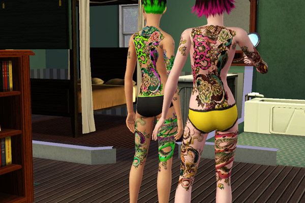
I used 3 colors and 1 yellow-only overlay to create that (b/c we haven't figured out how to put 4 colors on a CAS part yet), but it looks like there are a lot more than only 4 colors due to the blending of multiple colors.
I've noticed that it's not as good as the blending that happens in patterns. You lose a lot of subtlety b/c it doesn't seem to detect grays darker than a certain point. (According to Hanlon Razor's tutorial, this is about 151/151/151) However, you can create things with the appearance of more than just 3 or 4 colors by layering colors with transparency.
.:Kitty Klan:.
Visit for Sims 3 Hair, Tattoos, and other free custom content downloads.
.For website updates, subscribe to my RSS feed at.
Dreamwidth Blog
Visit for Sims 3 Hair, Tattoos, and other free custom content downloads.
.For website updates, subscribe to my RSS feed at.
Dreamwidth Blog
#5
18th Jul 2009 at 2:53 AM
18th Jul 2009 at 2:53 AM
Posts: 152
Thanks: 8823 in 20 Posts
Those tatoos are awesome.
You could have your basic 3 colour pallette, then overlap each with a 155 level grey from the other 2, so 6 more colours? Then overlap with say a 180 grey etc.
I wonder how many colours the eye could perceive from this?
EDIT
Things to try: What if we used a standard full colour image as a mask? What would that produce on screen? What would a fractal pattern look like on, say, a T-shirt, and how would it adjust with the sliders?
Something, something, something, Darkside
#6
18th Jul 2009 at 4:45 AM
18th Jul 2009 at 4:45 AM
Posts: 960
Thanks: 19178 in 34 Posts
Quote: Originally posted by RoguePilot
|
Those tatoos are awesome. You could have your basic 3 colour pallette, then overlap each with a 155 level grey from the other 2, so 6 more colours? Then overlap with say a 180 grey etc. I wonder how many colours the eye could perceive from this? |
Thanks.
For how many colors the eye could perceive? Not sure. A lot. I think my tattoos are a good example of approximately how many colors you can get out of it. For one, the pattern colors in it are set to pink, green, and cyan, so you're getting the full effect of how they blend together.
The original file had a LOT more depth and subtlety to the colors of the tattoos (and a wider range of colors as well), but I found in the game that the colors simply didn't appear in the game because they were too transparent. So I had to go back and play with the levels of each channel, making each more opaque.
Other things to keep in mind are that the base texture and alpha make a huge difference in color as well. (Though changing the alpha may only be an option for tattoos.)
Quote:
| Things to try: What if we used a standard full colour image as a mask? What would that produce on screen? What would a fractal pattern look like on, say, a T-shirt, and how would it adjust with the sliders? |
I tried something like this when I was making patterns.
The hardest thing with using a full color image as the mask is that the colors are SO interconnected that it's hard to change the color of one channel without drastically affecting how the entire image looks. If you've ever flipped through the RGB channels before and made one invisible, you'll know what I mean. The ENTIRE image ends up looking very red or blue tinted. I think it could probably be done, but I'm skeptical that the default RGB color separation will translate into an image with much versatility. That is, it will ONLY look good when the patterns are set to Red, Green, and Blue. But if you change one just a little, the entire image will look like it's being viewed under red-colored goggles. Make sense?
.:Kitty Klan:.
Visit for Sims 3 Hair, Tattoos, and other free custom content downloads.
.For website updates, subscribe to my RSS feed at.
Dreamwidth Blog
Visit for Sims 3 Hair, Tattoos, and other free custom content downloads.
.For website updates, subscribe to my RSS feed at.
Dreamwidth Blog
Who Posted
|
|