
 Sign in to Mod The Sims
- Site Map >
- Community >
- Sims Discussion >
- Sims 3 >
- Sims 3 Contests >
- Closed Contests >
- Finished - Design This - An Interior Design Contest - FINAL SCORES UP
- Site Map >
- Community >
- Sims Discussion >
- Sims 3 >
- Sims 3 Contests >
- Closed Contests >
- Finished - Design This - An Interior Design Contest - FINAL SCORES UP
#101
 25th Oct 2012 at 5:57 PM
25th Oct 2012 at 5:57 PM
Quote: Originally posted by Menaceman44
| Just thought of a question; do we get penalised for having MORE than the number of deco items specified? Or is that number a minimum? |
Obviously only Reya can really answer this question, but I sent her my scores for the last round yesterday and I didn't penalise people for having more than the 5 required pieces of deco (or more than 4 seats, or more than 1 entertainment item etc). I assumed (and still assume!) that the requirements are a minimum rather than an exact required total :-)
Advertisement
#102
25th Oct 2012 at 6:04 PM
25th Oct 2012 at 6:04 PM
Posts: 1,114
Thanks: 255 in 5 Posts
Quote:
|
Entry Format: Budget: Photo required. If you have windows, you can use the “print screen” button to take a screenshot. For macs you press Command-Shift-3. Required Photos: - 1 overhead (gridlines allowed if you want to merge this one with the budget photo. I don’t mind) - Minimum 4, Maximum 6 in game photos. (So no grid lines. Does not include the budget and overhead photos) |
It's come to my attention that people didn't notice that requirement change. So I'm pointing it out now. Instead of letting the first two entrants edit their entries (and risk having entries 3 and 4 with the same mistake) I'm going to change the minimum number of photos back down to three.
In the following rounds the number of photos required WILL change and if you're above or below you WILL be docked points.
volvenom, your entry is being added now.
Menaceman44 Laura is correct, there's no point deduction for going above and beyond the item requirements. Go wild!
#103
25th Oct 2012 at 6:25 PM
25th Oct 2012 at 6:25 PM
That's good to know, thanks.
I'm nearly done with my entry now but I'll probably have to wait until tomorrow to submit my pictures as I will be off out to meet friends within the hour.
I'm nearly done with my entry now but I'll probably have to wait until tomorrow to submit my pictures as I will be off out to meet friends within the hour.
#104
25th Oct 2012 at 9:51 PM
25th Oct 2012 at 9:51 PM
Don't hit me! But can I do the same thing I did before with the faux hallway?
"Holy Shift! Check out the asymptotes on that mother function!"
"Holy Shift! Check out the asymptotes on that mother function!"
#105
25th Oct 2012 at 9:56 PM
25th Oct 2012 at 9:56 PM
Posts: 1,114
Thanks: 255 in 5 Posts
ROUND 1 SCORES
Individual evaluations:
jones7659
Gothic is really not my style so I don’t have criticism, since I don’t know much about gothic. Layout is good, columns and curtain are very creative. Maybe obelisk red is not going very well with dark red on the walls.
I think that you did an excellent job with this lot. The room looks like it would work well as a living room and the Victorian Gothic theme makes a lot of sense when it comes to incorporating the obelisk and the black wall. Adding a second obelisk was a brave choice but I think you pulled it off! I do think that the patterned wallpaper is a little overpowering and perhaps something simpler would have worked better. Maybe you could’ve used it for a feature wall instead.
I really love how you handled the gothc style, and the way you incorporated pillars into the room was spot on. However I found the wallpaper to be really busy. Maybe next time try something a little less busy for the walls.
It's a very interesting and unique choice for the room design. You've incorporated the black wall with some stone columns, which made it look like it belongs there. The walls are a little dark and the floor CAST'ing choice looks a little off, but in general it's a very nice style
SeeMyu
The theme was living room and this is more artist corner then living room. Anyway, I think even it is artist room you could scale down number of pictures on the wall. (there is only seating for two so requirements are 9 points)
I like the colour scheme that you used for your room but I would’ve liked to have seen more turquoise, other than on the walls. Unfortunately you were missing seating for two – you have a loveseat but were meant to have seating for four. Using the obelisk as a centrepiece was a bold idea but I’m afraid it doesn’t work for me – it makes the layout of the room very awkward as it is so close to the loveseat and to me it feels very out of place there.
Using the obelisk as part of an interior pond centerpiece was really unique and i applaud you for that. However placing it in the very middle of the room made the room feel smaller than it already is and makes the playability of it seem awkward. Not to mention the lack of two required seats. Even so the decorative element of the room is great, and I love the easel in the corner.
Very lovely and fresh looking design. I love how you positioned the sofa and rug, the room looks very realistic and cozy. It looks like you forgot to add another 2 seats for the seating for 4 requirement, so the point was taken from there. Otherwise it's a splendid room design with an artistic touch to it
sionelle
Very good, modern, I like the colors you choose. Two things, maybe its just me but in the living room it is natural that you have coffee table in the front of seating, without it, it look a little empty. By the shape mirror fits perfectly in the room, but style of mirror is not modern like the rest of the furniture. Try not to mix styles next time.
I love your use of colour – the purple and lime accents go well with the black and white and I like the way that they are reflected in the paintings as well as the sofa/rug. Unfortunately they really don’t go with the obelisk, so you tried to hide it behind the fish tank. I can’t imagine anyone having something like that behind an aquarium in real life and it was obviously only there because it had to be rather than because it added to the room, so you missed out on points in the layout and Fun Stuff categories from me because of that.
Great job minding the budget, and can I just say hat the way you incorporated your colours was fantastic! I’m so in love with your rug it’s not even funny. I do however wish you’d incorporated the obelisk more. I like the idea of using it as a backdrop to the fishtank, but the way you incorporated it makes it look more like you were just trying to hide it. The use of the black wall was spot on, and i love the contrast between the white and black for your wall colours. Great job.
A very clever way to hide the obelisk behind the aquarium, you really nailed this requirement The layout made the room look bigger, which is very good and the colour scheme is well executed. I'm really surprised how this luxurious looking room can be under 10k, good job on keeping the budged within the limit. The diagonal wall near the aquarium looks a little empty though
charmedqueen
Dont use too much different patterns in one room. Use wall decoration and pictures in the same style as room is. (I think on the blue pictures)
I like the colour scheme here – it is very little old ladyish but there’s nothing wrong with that! I think my grandma would like it. I don’t think that it goes with the black wall and the obelisk though – the colour scheme, objects and layout all go well together with the exception of those things. I think that the room needed more deco/clutter – little old ladies are kind of known for having lots of stuff and you had plenty of money left over to add more items if you’d wanted to!
I LIKE the old lady style. I think it works well with the wall styles you used and the furniture looks great. I think more deco would have really brought the room to life, don’t hesitate to go a little wild with clutter. You can always remove it if you decide its too much. You are however missing a coffee table.
It's a lovely minimalistic design. You managed to keep the budget incredibly low - only little above 5k, great job! The colours are soft and the furniture is well CAST'ed, but the black wall looks a little off compared to the rest of the room.
Laserai
Try to play a little with colors and use 2 or 3 different ones. I love symmetry, but all room symmetrical is a little too much. Next time try make it less symmetrical and you will see you can get much more interesting creation.
I think that your colour scheme is nice and goes well with the black wall. The obelisk doesn’t look out of place, though I think it would’ve looked better against the wall rather than with a light behind it. It goes fairly well with the rest of the deco but it would’ve been nice if the flowers on it had matched the flowers on the other plants – red would have worked well as an accent colour with your colour scheme. The two identical paintings look odd to me though – who would have two identical paintings in the same room?!
I really adore the simple decor and soft colour scheme. The pink flowers next to the radio bring a bit of light into the room but I think a red colour would have worked better to match the flowers of the obelisk. On that same topic I LOVE what you did to the obelisk, especially when you look at it with the black wall as a background. Gorgeous.
Great choice of wall and furniture colours, I love the luxurious look of the room. The wooden pattern on the floor could be a little more fancy looking, but otherwise the CAST'ing is great. The layout looks a little too symmetrical, so it looks less realistic.
King_Deadly
Next time pay attention to the walls and floors. Different wood textures are not always going with each other. Try to play with a cast and see what other combinations you can get.
I like the layout and the colour scheme – I think that the angle between the sofa and the stereo would make for good listening in real life! It looks like it could be used as a real room, which is good. The obelisk does look out of place though, tucked away in a corner like that, and it’s a shame that it’s not integrated in to the room more. I also think that a round rug would have made more sense given the room’s layout – it would’ve really pulled the seating are together.
Can I just say that the diagonal rug has stolen my heart? It’s little details like that that just make me so happy. I really like your walls but I wish you’d done something different with the floors or matched it closer to the wall panelling style. It just looks a little off.
Very cozy and elegant room design. The colours are dark, but mixed with wooden patterns they add more coziness to the atmosphere. The diagonal rug placement is also a nice touch. The walls look a little empty, another painting or a torch light would be nice to add.
Zoeycuddly183
If you use black and white you can use more then one color for the accents. I think it would look better if you move coffee table one tile from seating, I'm not sure is it playable now.
I love your colour scheme – having one accent colour works well and it’s very consistent. I think that having the walls and the carpet in white makes them blend together too much though – perhaps some pattern on the walls or a black or grey carpet would’ve helped. The layout makes sense and the obelisk and black wall fit well in the room, though that big rose thing behind the obelisk seems to me to be an unnecessary distraction from the obelisk itself.
The roses are just perfect! I love how you used it to make the obelisk seem planned and using the red throughout the room just brings everything together. Everything matches perfectly and I really have no critiques.
I really like the roses deco part, it made the obelisk look like a planned detail of the main design. You also used a great colour scheme - monochromatic with one bright colour in it, this works wonders with all modern designs. The furniture and CAST'ing looks clean and neat, everything is matched together perfectly. Great job!
Jaguwar
You should try to use more light in your rooms. I would suggest using more patterns/colors in the rooms. It is a little unrealistic to have curtain with the same color as the walls.
I was unsure about the column thing around the TV when I saw it on the overhead but on your other pictures I like it and I think it works well. The obelisk makes a good backdrop. I like your colours, but I wasn’t keen on the wallpaper – too busy and too bright for the room in my opinion. I think that the layout works well and makes sense – it looks like a very habitable room.
When I saw the first overhead photo with the columns I was worried it would look terrible but your other photos proved me wrong and I’m so glad they did. I love the colours you picked and the room feels really natural and nice. I’d love to spend time there. However (and I know I’m being really nitpicky here) your lights make me giggle... the cartoon reindeer just doesn’t suit the room.
The whole room looks very well composed, the colour scheme is great and the furniture matches the style. All the little decorations make it look very cozy and realistic I'm not sure about the layout, it looks like some of the objects are placed very close together, which can result in sims getting stuck. Despite that, it's an amazing entry!
Amalgam81
Try to take your pictures in live mode. it is a little hard to see your creativity through grid lines.
I like the layout and the colours used in this room. Adding extra accent walls and a second big plant worked well and make the room look more sensible that if it’d just had the one black wall and the obelisk. Great idea! I’m not a fan of the big painting as I don’t think it matches the colour scheme as well as it could – would’ve been nice to see something with some red in it to help pull the room together.
So glad you figured out how to post pictures. I really love the colours you picked for the room and I am SO in love with your seat patterns. The mirrors and paintings you picked look awesome- actually scratch that. ALL the deco looks awesome and I really like how you pulled in the other plants. The obelisk and dark wall look great. Awesome job.
I love the style you chose for the room, it looks like a nice modern lounge for sims to relax The bottle shack is a nice touch too. The menus and notifications hide the portion of the room in all the pictures, so it was hard to see all the details. Besides that - great job!
Volvenom
I like the room layout and think fountain with obelisk is very creative, but I would suggest not use much different patterns with bright colors in the same room. I think obelisk red color and pink carpet clash. Try use colors that go with other colors in the room.
I like the way you incorporated the obelisk here, though I’m not sure fountains make complete sense in a living room! It’s quirky, but I quite like it. I don’t like the wallpaper and the rug though – one or the other would’ve been fine, but the different colours and patterns don’t work well together for me. The wallpaper is also very busy given that it covers such a large area. There doesn’t seem to be much of a colour scheme in the room as a whole, apart from the wallpaper and coffee table, which makes the room seem rather fragmented.
I find the wall pattern to be a bit busy, and it just seems off, even though it matches your coffee table. I love the idea of using the blue but I’m not sure the gold works with it. Using the fountains inside was a really unique idea but I don’t know that it makes sense for the inside of a living room.
What an interesting style - the unusual choice of colours makes it look very unique. I love the little fountains you've incorporated with the obelisk and another black wall is a nice way to make the ""fun part"" work for your room. The lighting could be a little brighter and the walls could be less empty, but in general, it's a very strong and interesting entry
Tamlyn
It is nice, pretty and modern. i actually don’t have any criticism here. Good work.
I like the colour scheme and the layout of your room. The green of the plants does seem unnaturally bright, but other than that I thought that your colours worked well and really pulled the room together. I am also uncertain about the rug – I think it’s unnecessarily distracting and takes away attention from other objects. The obelisk and black wall work really well in this room – good job! Oh, and on a random note, for which I did not detract points as it’s just a random thought I had and I feel daft thinking it, does anyone else think that the vase on the coffee table looked kind of ghostly and a bit creepy?
I love how you used the red to pull the room together but I think using red wood for the TV just didn’t work. I’m not sure if you can change the pattern of the TV from wood, but otherwise I would recommend using a more modern looking TV to fit the room, even if it were smaller than the one you have now. I am however madly in love with the use of the bonsai tree. That’s just awesome.
The layout looks great, in terms of sims moving around - it's also well thought through. I like the colour scheme, the red always works well with black and white. The double colored walls is a nice idea, but the cracked paint pattern doesn't mix well with the polished modern look. The red on the carpet is a little too bright, but other than that - great job
Daluved1
Very creative with the windows and doors, and pretty too. Layout is very good, like it is a real living room. Only one thing - try to use more lights in your rooms. you could use lights from buy debug.
I like the layout, apart from the dining chair which looks out of place to me. The colour scheme seems very dark and a bit gloomy and the wallpaper is very busy. The obelisk seems a bit out of place like it’s just been shoved out of the way in a corner – it doesn’t feel like an important part of the room. The black wall fits in alright, but only because the whole room seems quite dark.
I find the wall pattern to be really busy, especially when you look at the couch. The obelisk looks like it was just thrown in there but the coffee table as an ottoman was a brilliant stroke of creative genius. I never would have thought of that.
Wow, you actually added doors and windows and the room looks so realistic! And the coffee table as faux ottoman is a brilliant idea, very creative. The colour scheme is nice, the patterns are neat and the furniture matches the room's style. The lighting could use some work, it's a little too dark in there. Other than that the room is awesome.
sharill63
Try to use more different colors. I think you should work on a taking photos. Don’t take pictures through flowers or other items.
I like the layout of your room – it looks very playable and makes sense as a cosy real living room as well. I’m not keen on the colour scheme though - all that brown and yellow would be hard on the eyes if you were actually in that room, I think. Your repetition with the black wall works well and helps tie the room together (and it works with your choice of colour scheme) and the obelisk makes sense where it is, though I would’ve liked to have seen it as more of a feature piece in the room.
From what I could see of the room I really like the colours you picked and i think the layout looks very natural and real. However next time please don’t take obstructed photos. They’re creative but they don’t let us enjoy the room.
I like the layout of this room, it's very simple, but well executed. The windows are a great addition to the whole design, they fill up the diagonal walls and make the room look more realistic. The colour scheme has too much orange and brown in it, one or two additional colors mixed up somewhere in the room would be a nice touch. Besides that, the room looks great
Buckley
pretty and nice. One thing - don’t use tall items in the front of the windows.
I am not remotely a girly girl but I would happily have this room in my house in real life. I like the layout and the colour scheme – the green/pink/red/brown works well in my opinion and the black wall and the obelisk (plus extra obelisk) don’t look out of place amongst the other plants. I’m not keen on the sunflowers and would’ve rather seen an extension of the pink/red used elsewhere as the yellow looks overly bright and out of place to me and is only used for two objects.
I do NOT consider myself a girly girl but if I walked into this room I would giggle like a kid and never want to leave. The furniture you picked was unique and interesting, the decor looks natural and fun, and i love how you used the obelisks. The only critique I can give is that it doesn’t really say “living room” to me.
Oh, where do I begin? The colour scheme - interesting, soft and well matched. Layout - original and creative. The use of obelisk - very nifty, makes it look like it belongs there. I also love the picture wall behind the writing desk. No need to mention the furniture and decorations you chose for this room, they're fabulous. The only thing I'm not sure is the function of the room, it looks more like a hobby/work room than a living room. Besides that - amazing entry!
leriety
Try to use colors that go together. Dont use outdoor items inside (topiaries).
I like the idea behind this, the indoor garden concept, but the layout seems a little awkward to me. Having the sundial in the middle of the room between the seating would make conversation difficult. The colour scheme is nice but doesn’t really work with the black wall. The obelisk looks like it’s in its natural setting here, so that works well, but I don’t think that the topiary hedges work indoors – at least not without being made to look like they’re in some kind of pot or raised flower bed. Also, you don’t have the required overhead photo which made it difficult to get a feel for your layout and check that all the required items were present.
I’m afraid you’re missing a proper overhead photo. Try looking at how other people showed their layouts through the overhead photo and if you still have questions ask in the thread. The room itself through is very cute and I like the furniture you picked. I don’t really like how the green carpet looks with the blue walls. Go for something with more of a contrast.
That's a very interesting idea - to turn the living room into an indoor garden, it's great for nature loving sims. The use of green carpet works as grass and the little greenhouses are a nice touch to the design. The obelisk looks very well incorporate in the main style. The layout and colour scheme are a little chaotic, the wall colour doesn't mix well with red and green, but besides that it's a very interesting and unique room
Myshia
I see you going for eclectic style. Eclectic is a mixture of every style and it is hard make eclectic room which is looking good. I would suggest you next time not to use so many decorative stuff. There are to much things in front of the walls and area in front of the walls looks unaccessible which is not very realistic.
I love the eclecticness of this and I think that the mix of colours works well (and goes with the black wall) but I’m not keen on the layout of the room. There is unnecessary empty space behind most of the furniture that doesn’t seem to fulfil any particular purpose. I think that the room would make more sense with the furniture back against the walls. The obelisk looks OK behind the stereo but the mirror behind it looks odd and out of place – it can’t be seen properly and just distracts from the obelisk itself in my opinion.
Oh man that looks awesome. I love what you did with the radio, I’ve never seen anyone do that before and I think the obelisk looks great where it is. The wall patterns go together great, but I don’t see a coffee table, and the space behind the bookshelf looks a bit awkward.
I love the electric theme of the room, it has so much detail and creativity in it. An interesting use of WA Egyptian props on the black wall and the use of obelisk is very clever. All the decorations look a little chaotic at first, but they create an interesting atmosphere in the room, almost like ""Alice in Wonderland"" I don't see a coffee table in the room and the empty space behind the sofa and bookcase looks a little weird. Besides that - the room is lovely
Menaceman44
Try to use furniture in the same style. It seems that modern style coffee table and end table by the wall clash a little.
The layout of your room is nice and looks very practical, both as a sim house and as a real life house. The colour scheme is pleasant, though perhaps a little bland for my taste, and I don’t think that it makes the most of the black wall, which seems out of place. The obelisk works well as a backdrop to the sofa and fits in well with the rest of the room. I’m not keen on the column/archway thing though, it seems unnecessary and rather out of place.
I really love the use of the black wall as a backdrop for the entertainment section and mirror. I do however wish you’d tied it in more with the room. If you’d just CAST the walling to make even just a black band go along the top of the room I think it would have really increased your score. I love how you handed the obelisk too. It looks really nice as a backdrop behind the couch.
What a lovely room - it looks very realistic and comfortable. The colours are matched nicely, I love how the wood on the furniture fits the wood on the door. The walls are CAST'ed nicely too, making the room look more luxurious. The use of obelisk is very clever. The black wall looks a little out of place, but in general, it's a great room
obviously394
To me wooden floor with lighter wood squares looks a little unrealistic. All that rugs clash and it is too many of them.
I like the layout, though some of the chairs by the TV seem to be facing slightly the wrong way. The room is very busy and cluttered but I think that it works well in this case. I like the colour scheme (and concept) and I reckon that it would be a nice living room for a forest fairy! You did an excellent job incorporating the black wall and the obelisk – they fit well in their surroundings and don’t look the least bit out of place. I would’ve liked to have seen a bit more colour in the form of more flowers though.
Ah! The carpets look so awesome! I really love how unique everything looks and it is just so friggin cool. You really brought the outside in in a way that works so well and you made the fun elements meld into the room so much I didn’t notice them at first. Sometimes thats a bad thing but not this time. Great job.
Oh wow, that's a lot of rugs in one place The style of the room is very cute and interesting, perfect for the fairies. I love how you matched the brown and green colours, they fit the theme nicely. The windows and doors are also a nice addition to the room. The rugs look a little chaotic and the lighting is very dim, but other than that it's an awesome and interesting room
StardustX
Dont know what to say about this. maybe the colors are to dark and depressive for the living room. I think it is unrealistic to have the same pattern on the rug and sofa.
The layout of your room seems fairly practical but I’m not keen on the colour scheme. The white on the bottom of the walls doesn’t seem to fit with the rest of the room, and neither do some of the paintings. The black wall fits well with the rest of the room though more plants would’ve helped the obelisk look less out of place.
I really like the walling you picked and the colour scheme, everything looks so natural and I’d feel comfortable in that room. However the statues next to the obelisk (and really, just that whole area) look like they belong in a completely different room.
The overhead picture is a little too dark and too small, making it hard to see the details. I like how you used modern touches with a vampire theme, it makes the room look very interesting. The red obelisk fits the room nicely, making it an interesting part of the decorations. I'm not fond of the pattern and colour choice for the sofa and rug, they look a little weird now. The open arch leading outdoors is also a little awkward, but in general, it's a nice and creative entry
Solventpost
I think that light walls and floors really looks good with black and red furniture. Only one suggestion, you should use more furniture, not only required ones.
The layout of your room is simple but sensible. I like most of the colour scheme but the flooring looks out of place to me – the light grey colour is quite bland, especially with the grey/white walls, and it doesn’t show the room off to its best advantage. I’m also not keen on the blandness of the grey bookcase. The obelisk looks OK behind the sofa and the rug helps pull it into the room, but more plants and/or red flower print objects would’ve been even better. As it is it looks almost like two separate spaces – the obelisk/seating/rug area works well together but doesn’t tie in to the rest of the room. The black wall looks good and fits in well with everything else.
I’m not too convinced on the flooring you picked but it really does work well with the room as a whole. The furniture looks great, and I love how you incorporated the rose pattern into the rug. Good job.
I love the simplicity of the design, it has a slight ""grungy"" feel to it. The colour scheme is minimalistic, but well matched. I like the wooden floor and the metal bookcase, they add some variety to the design.
| Contestant | Judge A | Judge B | Judge C | Total |
|---|---|---|---|---|
| jones 7659 | 47 | 42 | 44 | 44.33 |
| SeeMyu | 37 | 44 | 39 | 40.00 |
| sionelle | 42 | 47 | 46 | 45.00 |
| charmedqueen | 41 | 40 | 36 | 39.00 |
| Laserai | 44 | 44 | 33 | 40.33 |
| King_Deadly | 44 | 45 | 38 | 42.33 |
| Zoeycuddly183 | 46 | 49 | 40 | 45.00 |
| Jaguwar | 45 | 47 | 41 | 44.33 |
| Amalgam81 | 47 | 44 | 41 | 44.00 |
| Volvenom | 40 | 45 | 45 | 43.33 |
| Tamlyn | 46 | 44 | 45 | 45.00 |
| Daluved1 | 40 | 46 | 47 | 44.33 |
| sharill63 | 43 | 44 | 37 | 41.33 |
| Buckley | 46 | 49 | 43 | 46.00 |
| leriety | 39 | 44 | 32 | 38.33 |
| Myshia | 37 | 48 | 35 | 40.00 |
| Menaceman44 | 44 | 47 | 40 | 43.67 |
| obviously394 | 47 | 48 | 35 | 43.33 |
| StardustX | 40 | 40 | 38 | 39.33 |
| Solventpost | 43 | 47 | 42 | 44.00 |
Individual evaluations:
jones7659
| Layout | Requirements | Rule | Colour Scheme | Fun Part | Total | Average | |
|---|---|---|---|---|---|---|---|
| Judge A | 9 | 10 | 10 | 9 | 9 | 47 | |
| Judge B | 7 | 10 | 10 | 7 | 8 | 42 | |
| Judge C | 9 | 10 | 10 | 8 | 7 | 44 | 44.33 |
Gothic is really not my style so I don’t have criticism, since I don’t know much about gothic. Layout is good, columns and curtain are very creative. Maybe obelisk red is not going very well with dark red on the walls.
I think that you did an excellent job with this lot. The room looks like it would work well as a living room and the Victorian Gothic theme makes a lot of sense when it comes to incorporating the obelisk and the black wall. Adding a second obelisk was a brave choice but I think you pulled it off! I do think that the patterned wallpaper is a little overpowering and perhaps something simpler would have worked better. Maybe you could’ve used it for a feature wall instead.
I really love how you handled the gothc style, and the way you incorporated pillars into the room was spot on. However I found the wallpaper to be really busy. Maybe next time try something a little less busy for the walls.
It's a very interesting and unique choice for the room design. You've incorporated the black wall with some stone columns, which made it look like it belongs there. The walls are a little dark and the floor CAST'ing choice looks a little off, but in general it's a very nice style
SeeMyu
| Layout | Requirements | Rule | Colour Scheme | Fun Part | Total | Average | |
|---|---|---|---|---|---|---|---|
| Judge A | 6 | 8 | 10 | 8 | 5 | 37 | |
| Judge B | 8 | 8 | 10 | 8 | 10 | 44 | |
| Judge C | 7 | 9 | 10 | 6 | 7 | 39 | 40.00 |
The theme was living room and this is more artist corner then living room. Anyway, I think even it is artist room you could scale down number of pictures on the wall. (there is only seating for two so requirements are 9 points)
I like the colour scheme that you used for your room but I would’ve liked to have seen more turquoise, other than on the walls. Unfortunately you were missing seating for two – you have a loveseat but were meant to have seating for four. Using the obelisk as a centrepiece was a bold idea but I’m afraid it doesn’t work for me – it makes the layout of the room very awkward as it is so close to the loveseat and to me it feels very out of place there.
Using the obelisk as part of an interior pond centerpiece was really unique and i applaud you for that. However placing it in the very middle of the room made the room feel smaller than it already is and makes the playability of it seem awkward. Not to mention the lack of two required seats. Even so the decorative element of the room is great, and I love the easel in the corner.
Very lovely and fresh looking design. I love how you positioned the sofa and rug, the room looks very realistic and cozy. It looks like you forgot to add another 2 seats for the seating for 4 requirement, so the point was taken from there. Otherwise it's a splendid room design with an artistic touch to it
sionelle
| Layout | Requirements | Rule | Colour Scheme | Fun Part | Total | Average | |
|---|---|---|---|---|---|---|---|
| Judge A | 8 | 10 | 10 | 9 | 5 | 42 | |
| Judge B | 8 | 10 | 10 | 9 | 10 | 47 | |
| Judge C | 8 | 10 | 10 | 9 | 9 | 46 | 45.00 |
Very good, modern, I like the colors you choose. Two things, maybe its just me but in the living room it is natural that you have coffee table in the front of seating, without it, it look a little empty. By the shape mirror fits perfectly in the room, but style of mirror is not modern like the rest of the furniture. Try not to mix styles next time.
I love your use of colour – the purple and lime accents go well with the black and white and I like the way that they are reflected in the paintings as well as the sofa/rug. Unfortunately they really don’t go with the obelisk, so you tried to hide it behind the fish tank. I can’t imagine anyone having something like that behind an aquarium in real life and it was obviously only there because it had to be rather than because it added to the room, so you missed out on points in the layout and Fun Stuff categories from me because of that.
Great job minding the budget, and can I just say hat the way you incorporated your colours was fantastic! I’m so in love with your rug it’s not even funny. I do however wish you’d incorporated the obelisk more. I like the idea of using it as a backdrop to the fishtank, but the way you incorporated it makes it look more like you were just trying to hide it. The use of the black wall was spot on, and i love the contrast between the white and black for your wall colours. Great job.
A very clever way to hide the obelisk behind the aquarium, you really nailed this requirement The layout made the room look bigger, which is very good and the colour scheme is well executed. I'm really surprised how this luxurious looking room can be under 10k, good job on keeping the budged within the limit. The diagonal wall near the aquarium looks a little empty though
charmedqueen
| Layout | Requirements | Rule | Colour Scheme | Fun Part | Total | Average | |
|---|---|---|---|---|---|---|---|
| Judge A | 9 | 9 | 10 | 8 | 5 | 41 | |
| Judge B | 6 | 9 | 10 | 7 | 8 | 40 | |
| Judge C | 7 | 9 | 10 | 5 | 5 | 36 | 39.00 |
Dont use too much different patterns in one room. Use wall decoration and pictures in the same style as room is. (I think on the blue pictures)
I like the colour scheme here – it is very little old ladyish but there’s nothing wrong with that! I think my grandma would like it. I don’t think that it goes with the black wall and the obelisk though – the colour scheme, objects and layout all go well together with the exception of those things. I think that the room needed more deco/clutter – little old ladies are kind of known for having lots of stuff and you had plenty of money left over to add more items if you’d wanted to!
I LIKE the old lady style. I think it works well with the wall styles you used and the furniture looks great. I think more deco would have really brought the room to life, don’t hesitate to go a little wild with clutter. You can always remove it if you decide its too much. You are however missing a coffee table.
It's a lovely minimalistic design. You managed to keep the budget incredibly low - only little above 5k, great job! The colours are soft and the furniture is well CAST'ed, but the black wall looks a little off compared to the rest of the room.
Laserai
| Layout | Requirements | Rule | Colour Scheme | Fun Part | Total | Average | |
|---|---|---|---|---|---|---|---|
| Judge A | 9 | 10 | 10 | 8 | 7 | 44 | |
| Judge B | 7 | 10 | 10 | 8 | 9 | 44 | |
| Judge C | 5 | 10 | 10 | 4 | 4 | 33 | 40.33 |
Try to play a little with colors and use 2 or 3 different ones. I love symmetry, but all room symmetrical is a little too much. Next time try make it less symmetrical and you will see you can get much more interesting creation.
I think that your colour scheme is nice and goes well with the black wall. The obelisk doesn’t look out of place, though I think it would’ve looked better against the wall rather than with a light behind it. It goes fairly well with the rest of the deco but it would’ve been nice if the flowers on it had matched the flowers on the other plants – red would have worked well as an accent colour with your colour scheme. The two identical paintings look odd to me though – who would have two identical paintings in the same room?!
I really adore the simple decor and soft colour scheme. The pink flowers next to the radio bring a bit of light into the room but I think a red colour would have worked better to match the flowers of the obelisk. On that same topic I LOVE what you did to the obelisk, especially when you look at it with the black wall as a background. Gorgeous.
Great choice of wall and furniture colours, I love the luxurious look of the room. The wooden pattern on the floor could be a little more fancy looking, but otherwise the CAST'ing is great. The layout looks a little too symmetrical, so it looks less realistic.
King_Deadly
| Layout | Requirements | Rule | Colour Scheme | Fun Part | Total | Average | |
|---|---|---|---|---|---|---|---|
| Judge A | 9 | 10 | 10 | 9 | 6 | 44 | |
| Judge B | 8 | 10 | 10 | 8 | 9 | 45 | |
| Judge C | 7 | 10 | 10 | 6 | 5 | 38 | 42.33 |
Next time pay attention to the walls and floors. Different wood textures are not always going with each other. Try to play with a cast and see what other combinations you can get.
I like the layout and the colour scheme – I think that the angle between the sofa and the stereo would make for good listening in real life! It looks like it could be used as a real room, which is good. The obelisk does look out of place though, tucked away in a corner like that, and it’s a shame that it’s not integrated in to the room more. I also think that a round rug would have made more sense given the room’s layout – it would’ve really pulled the seating are together.
Can I just say that the diagonal rug has stolen my heart? It’s little details like that that just make me so happy. I really like your walls but I wish you’d done something different with the floors or matched it closer to the wall panelling style. It just looks a little off.
Very cozy and elegant room design. The colours are dark, but mixed with wooden patterns they add more coziness to the atmosphere. The diagonal rug placement is also a nice touch. The walls look a little empty, another painting or a torch light would be nice to add.
Zoeycuddly183
| Layout | Requirements | Rule | Colour Scheme | Fun Part | Total | Average | |
|---|---|---|---|---|---|---|---|
| Judge A | 9 | 10 | 10 | 9 | 8 | 46 | |
| Judge B | 9 | 10 | 10 | 10 | 10 | 49 | |
| Judge C | 6 | 10 | 10 | 7 | 7 | 40 | 45.00 |
If you use black and white you can use more then one color for the accents. I think it would look better if you move coffee table one tile from seating, I'm not sure is it playable now.
I love your colour scheme – having one accent colour works well and it’s very consistent. I think that having the walls and the carpet in white makes them blend together too much though – perhaps some pattern on the walls or a black or grey carpet would’ve helped. The layout makes sense and the obelisk and black wall fit well in the room, though that big rose thing behind the obelisk seems to me to be an unnecessary distraction from the obelisk itself.
The roses are just perfect! I love how you used it to make the obelisk seem planned and using the red throughout the room just brings everything together. Everything matches perfectly and I really have no critiques.
I really like the roses deco part, it made the obelisk look like a planned detail of the main design. You also used a great colour scheme - monochromatic with one bright colour in it, this works wonders with all modern designs. The furniture and CAST'ing looks clean and neat, everything is matched together perfectly. Great job!
Jaguwar
| Layout | Requirements | Rule | Colour Scheme | Fun Part | Total | Average | |
|---|---|---|---|---|---|---|---|
| Judge A | 10 | 10 | 10 | 7 | 8 | 45 | |
| Judge B | 7 | 10 | 10 | 10 | 10 | 47 | |
| Judge C | 8 | 10 | 10 | 7 | 6 | 41 | 44.33 |
You should try to use more light in your rooms. I would suggest using more patterns/colors in the rooms. It is a little unrealistic to have curtain with the same color as the walls.
I was unsure about the column thing around the TV when I saw it on the overhead but on your other pictures I like it and I think it works well. The obelisk makes a good backdrop. I like your colours, but I wasn’t keen on the wallpaper – too busy and too bright for the room in my opinion. I think that the layout works well and makes sense – it looks like a very habitable room.
When I saw the first overhead photo with the columns I was worried it would look terrible but your other photos proved me wrong and I’m so glad they did. I love the colours you picked and the room feels really natural and nice. I’d love to spend time there. However (and I know I’m being really nitpicky here) your lights make me giggle... the cartoon reindeer just doesn’t suit the room.
The whole room looks very well composed, the colour scheme is great and the furniture matches the style. All the little decorations make it look very cozy and realistic I'm not sure about the layout, it looks like some of the objects are placed very close together, which can result in sims getting stuck. Despite that, it's an amazing entry!
Amalgam81
| Layout | Requirements | Rule | Colour Scheme | Fun Part | Total | Average | |
|---|---|---|---|---|---|---|---|
| Judge A | 9 | 10 | 10 | 9 | 9 | 47 | |
| Judge B | 8 | 10 | 10 | 8 | 8 | 44 | |
| Judge C | 8 | 10 | 10 | 7 | 6 | 41 | 44.00 |
Try to take your pictures in live mode. it is a little hard to see your creativity through grid lines.
I like the layout and the colours used in this room. Adding extra accent walls and a second big plant worked well and make the room look more sensible that if it’d just had the one black wall and the obelisk. Great idea! I’m not a fan of the big painting as I don’t think it matches the colour scheme as well as it could – would’ve been nice to see something with some red in it to help pull the room together.
So glad you figured out how to post pictures. I really love the colours you picked for the room and I am SO in love with your seat patterns. The mirrors and paintings you picked look awesome- actually scratch that. ALL the deco looks awesome and I really like how you pulled in the other plants. The obelisk and dark wall look great. Awesome job.
I love the style you chose for the room, it looks like a nice modern lounge for sims to relax The bottle shack is a nice touch too. The menus and notifications hide the portion of the room in all the pictures, so it was hard to see all the details. Besides that - great job!
Volvenom
| Layout | Requirements | Rule | Colour Scheme | Fun Part | Total | Average | |
|---|---|---|---|---|---|---|---|
| Judge A | 7 | 10 | 10 | 6 | 7 | 40 | |
| Judge B | 8 | 10 | 10 | 8 | 9 | 45 | |
| Judge C | 9 | 10 | 10 | 7 | 9 | 45 | 43.33 |
I like the room layout and think fountain with obelisk is very creative, but I would suggest not use much different patterns with bright colors in the same room. I think obelisk red color and pink carpet clash. Try use colors that go with other colors in the room.
I like the way you incorporated the obelisk here, though I’m not sure fountains make complete sense in a living room! It’s quirky, but I quite like it. I don’t like the wallpaper and the rug though – one or the other would’ve been fine, but the different colours and patterns don’t work well together for me. The wallpaper is also very busy given that it covers such a large area. There doesn’t seem to be much of a colour scheme in the room as a whole, apart from the wallpaper and coffee table, which makes the room seem rather fragmented.
I find the wall pattern to be a bit busy, and it just seems off, even though it matches your coffee table. I love the idea of using the blue but I’m not sure the gold works with it. Using the fountains inside was a really unique idea but I don’t know that it makes sense for the inside of a living room.
What an interesting style - the unusual choice of colours makes it look very unique. I love the little fountains you've incorporated with the obelisk and another black wall is a nice way to make the ""fun part"" work for your room. The lighting could be a little brighter and the walls could be less empty, but in general, it's a very strong and interesting entry
Tamlyn
| Layout | Requirements | Rule | Colour Scheme | Fun Part | Total | Average | |
|---|---|---|---|---|---|---|---|
| Judge A | 9 | 10 | 10 | 8 | 9 | 46 | |
| Judge B | 8 | 10 | 10 | 8 | 8 | 44 | |
| Judge C | 9 | 10 | 10 | 9 | 7 | 45 | 45.00 |
It is nice, pretty and modern. i actually don’t have any criticism here. Good work.
I like the colour scheme and the layout of your room. The green of the plants does seem unnaturally bright, but other than that I thought that your colours worked well and really pulled the room together. I am also uncertain about the rug – I think it’s unnecessarily distracting and takes away attention from other objects. The obelisk and black wall work really well in this room – good job! Oh, and on a random note, for which I did not detract points as it’s just a random thought I had and I feel daft thinking it, does anyone else think that the vase on the coffee table looked kind of ghostly and a bit creepy?
I love how you used the red to pull the room together but I think using red wood for the TV just didn’t work. I’m not sure if you can change the pattern of the TV from wood, but otherwise I would recommend using a more modern looking TV to fit the room, even if it were smaller than the one you have now. I am however madly in love with the use of the bonsai tree. That’s just awesome.
The layout looks great, in terms of sims moving around - it's also well thought through. I like the colour scheme, the red always works well with black and white. The double colored walls is a nice idea, but the cracked paint pattern doesn't mix well with the polished modern look. The red on the carpet is a little too bright, but other than that - great job
Daluved1
| Layout | Requirements | Rule | Colour Scheme | Fun Part | Total | Average | |
|---|---|---|---|---|---|---|---|
| Judge A | 9 | 10 | 10 | 5 | 6 | 40 | |
| Judge B | 9 | 10 | 10 | 9 | 8 | 46 | |
| Judge C | 9 | 10 | 10 | 9 | 9 | 47 | 44.33 |
Very creative with the windows and doors, and pretty too. Layout is very good, like it is a real living room. Only one thing - try to use more lights in your rooms. you could use lights from buy debug.
I like the layout, apart from the dining chair which looks out of place to me. The colour scheme seems very dark and a bit gloomy and the wallpaper is very busy. The obelisk seems a bit out of place like it’s just been shoved out of the way in a corner – it doesn’t feel like an important part of the room. The black wall fits in alright, but only because the whole room seems quite dark.
I find the wall pattern to be really busy, especially when you look at the couch. The obelisk looks like it was just thrown in there but the coffee table as an ottoman was a brilliant stroke of creative genius. I never would have thought of that.
Wow, you actually added doors and windows and the room looks so realistic! And the coffee table as faux ottoman is a brilliant idea, very creative. The colour scheme is nice, the patterns are neat and the furniture matches the room's style. The lighting could use some work, it's a little too dark in there. Other than that the room is awesome.
sharill63
| Layout | Requirements | Rule | Colour Scheme | Fun Part | Total | Average | |
|---|---|---|---|---|---|---|---|
| Judge A | 9 | 10 | 10 | 6 | 8 | 43 | |
| Judge B | 9 | 10 | 10 | 7 | 8 | 44 | |
| Judge C | 7 | 10 | 10 | 5 | 5 | 37 | 41.33 |
Try to use more different colors. I think you should work on a taking photos. Don’t take pictures through flowers or other items.
I like the layout of your room – it looks very playable and makes sense as a cosy real living room as well. I’m not keen on the colour scheme though - all that brown and yellow would be hard on the eyes if you were actually in that room, I think. Your repetition with the black wall works well and helps tie the room together (and it works with your choice of colour scheme) and the obelisk makes sense where it is, though I would’ve liked to have seen it as more of a feature piece in the room.
From what I could see of the room I really like the colours you picked and i think the layout looks very natural and real. However next time please don’t take obstructed photos. They’re creative but they don’t let us enjoy the room.
I like the layout of this room, it's very simple, but well executed. The windows are a great addition to the whole design, they fill up the diagonal walls and make the room look more realistic. The colour scheme has too much orange and brown in it, one or two additional colors mixed up somewhere in the room would be a nice touch. Besides that, the room looks great
Buckley
| Layout | Requirements | Rule | Colour Scheme | Fun Part | Total | Average | |
|---|---|---|---|---|---|---|---|
| Judge A | 9 | 10 | 10 | 8 | 9 | 46 | |
| Judge B | 9 | 10 | 10 | 10 | 10 | 49 | |
| Judge C | 8 | 10 | 10 | 7 | 8 | 43 | 46.00 |
pretty and nice. One thing - don’t use tall items in the front of the windows.
I am not remotely a girly girl but I would happily have this room in my house in real life. I like the layout and the colour scheme – the green/pink/red/brown works well in my opinion and the black wall and the obelisk (plus extra obelisk) don’t look out of place amongst the other plants. I’m not keen on the sunflowers and would’ve rather seen an extension of the pink/red used elsewhere as the yellow looks overly bright and out of place to me and is only used for two objects.
I do NOT consider myself a girly girl but if I walked into this room I would giggle like a kid and never want to leave. The furniture you picked was unique and interesting, the decor looks natural and fun, and i love how you used the obelisks. The only critique I can give is that it doesn’t really say “living room” to me.
Oh, where do I begin? The colour scheme - interesting, soft and well matched. Layout - original and creative. The use of obelisk - very nifty, makes it look like it belongs there. I also love the picture wall behind the writing desk. No need to mention the furniture and decorations you chose for this room, they're fabulous. The only thing I'm not sure is the function of the room, it looks more like a hobby/work room than a living room. Besides that - amazing entry!
leriety
| Layout | Requirements | Rule | Colour Scheme | Fun Part | Total | Average | |
|---|---|---|---|---|---|---|---|
| Judge A | 6 | 10 | 8 | 8 | 7 | 39 | |
| Judge B | 7 | 10 | 10 | 7 | 10 | 44 | |
| Judge C | 5 | 10 | 8 | 4 | 5 | 32 | 38.33 |
Try to use colors that go together. Dont use outdoor items inside (topiaries).
I like the idea behind this, the indoor garden concept, but the layout seems a little awkward to me. Having the sundial in the middle of the room between the seating would make conversation difficult. The colour scheme is nice but doesn’t really work with the black wall. The obelisk looks like it’s in its natural setting here, so that works well, but I don’t think that the topiary hedges work indoors – at least not without being made to look like they’re in some kind of pot or raised flower bed. Also, you don’t have the required overhead photo which made it difficult to get a feel for your layout and check that all the required items were present.
I’m afraid you’re missing a proper overhead photo. Try looking at how other people showed their layouts through the overhead photo and if you still have questions ask in the thread. The room itself through is very cute and I like the furniture you picked. I don’t really like how the green carpet looks with the blue walls. Go for something with more of a contrast.
That's a very interesting idea - to turn the living room into an indoor garden, it's great for nature loving sims. The use of green carpet works as grass and the little greenhouses are a nice touch to the design. The obelisk looks very well incorporate in the main style. The layout and colour scheme are a little chaotic, the wall colour doesn't mix well with red and green, but besides that it's a very interesting and unique room
Myshia
| Layout | Requirements | Rule | Colour Scheme | Fun Part | Total | Average | |
|---|---|---|---|---|---|---|---|
| Judge A | 4 | 9 | 10 | 7 | 7 | 37 | |
| Judge B | 9 | 9 | 10 | 10 | 10 | 48 | |
| Judge C | 5 | 9 | 10 | 6 | 5 | 35 | 40.00 |
I see you going for eclectic style. Eclectic is a mixture of every style and it is hard make eclectic room which is looking good. I would suggest you next time not to use so many decorative stuff. There are to much things in front of the walls and area in front of the walls looks unaccessible which is not very realistic.
I love the eclecticness of this and I think that the mix of colours works well (and goes with the black wall) but I’m not keen on the layout of the room. There is unnecessary empty space behind most of the furniture that doesn’t seem to fulfil any particular purpose. I think that the room would make more sense with the furniture back against the walls. The obelisk looks OK behind the stereo but the mirror behind it looks odd and out of place – it can’t be seen properly and just distracts from the obelisk itself in my opinion.
Oh man that looks awesome. I love what you did with the radio, I’ve never seen anyone do that before and I think the obelisk looks great where it is. The wall patterns go together great, but I don’t see a coffee table, and the space behind the bookshelf looks a bit awkward.
I love the electric theme of the room, it has so much detail and creativity in it. An interesting use of WA Egyptian props on the black wall and the use of obelisk is very clever. All the decorations look a little chaotic at first, but they create an interesting atmosphere in the room, almost like ""Alice in Wonderland"" I don't see a coffee table in the room and the empty space behind the sofa and bookcase looks a little weird. Besides that - the room is lovely
Menaceman44
| Layout | Requirements | Rule | Colour Scheme | Fun Part | Total | Average | |
|---|---|---|---|---|---|---|---|
| Judge A | 9 | 10 | 10 | 8 | 7 | 44 | |
| Judge B | 9 | 10 | 10 | 9 | 9 | 47 | |
| Judge C | 7 | 10 | 10 | 7 | 6 | 40 | 43.67 |
Try to use furniture in the same style. It seems that modern style coffee table and end table by the wall clash a little.
The layout of your room is nice and looks very practical, both as a sim house and as a real life house. The colour scheme is pleasant, though perhaps a little bland for my taste, and I don’t think that it makes the most of the black wall, which seems out of place. The obelisk works well as a backdrop to the sofa and fits in well with the rest of the room. I’m not keen on the column/archway thing though, it seems unnecessary and rather out of place.
I really love the use of the black wall as a backdrop for the entertainment section and mirror. I do however wish you’d tied it in more with the room. If you’d just CAST the walling to make even just a black band go along the top of the room I think it would have really increased your score. I love how you handed the obelisk too. It looks really nice as a backdrop behind the couch.
What a lovely room - it looks very realistic and comfortable. The colours are matched nicely, I love how the wood on the furniture fits the wood on the door. The walls are CAST'ed nicely too, making the room look more luxurious. The use of obelisk is very clever. The black wall looks a little out of place, but in general, it's a great room
obviously394
| Layout | Requirements | Rule | Colour Scheme | Fun Part | Total | Average | |
|---|---|---|---|---|---|---|---|
| Judge A | 9 | 10 | 10 | 8 | 10 | 47 | |
| Judge B | 9 | 10 | 10 | 9 | 10 | 48 | |
| Judge C | 5 | 10 | 10 | 5 | 5 | 35 | 43.33 |
To me wooden floor with lighter wood squares looks a little unrealistic. All that rugs clash and it is too many of them.
I like the layout, though some of the chairs by the TV seem to be facing slightly the wrong way. The room is very busy and cluttered but I think that it works well in this case. I like the colour scheme (and concept) and I reckon that it would be a nice living room for a forest fairy! You did an excellent job incorporating the black wall and the obelisk – they fit well in their surroundings and don’t look the least bit out of place. I would’ve liked to have seen a bit more colour in the form of more flowers though.
Ah! The carpets look so awesome! I really love how unique everything looks and it is just so friggin cool. You really brought the outside in in a way that works so well and you made the fun elements meld into the room so much I didn’t notice them at first. Sometimes thats a bad thing but not this time. Great job.
Oh wow, that's a lot of rugs in one place The style of the room is very cute and interesting, perfect for the fairies. I love how you matched the brown and green colours, they fit the theme nicely. The windows and doors are also a nice addition to the room. The rugs look a little chaotic and the lighting is very dim, but other than that it's an awesome and interesting room
StardustX
| Layout | Requirements | Rule | Colour Scheme | Fun Part | Total | Average | |
|---|---|---|---|---|---|---|---|
| Judge A | 8 | 10 | 10 | 5 | 6 | 40 | |
| Judge B | 7 | 10 | 10 | 5 | 8 | 40 | |
| Judge C | 7 | 10 | 10 | 5 | 6 | 38 | 39.33 |
Dont know what to say about this. maybe the colors are to dark and depressive for the living room. I think it is unrealistic to have the same pattern on the rug and sofa.
The layout of your room seems fairly practical but I’m not keen on the colour scheme. The white on the bottom of the walls doesn’t seem to fit with the rest of the room, and neither do some of the paintings. The black wall fits well with the rest of the room though more plants would’ve helped the obelisk look less out of place.
I really like the walling you picked and the colour scheme, everything looks so natural and I’d feel comfortable in that room. However the statues next to the obelisk (and really, just that whole area) look like they belong in a completely different room.
The overhead picture is a little too dark and too small, making it hard to see the details. I like how you used modern touches with a vampire theme, it makes the room look very interesting. The red obelisk fits the room nicely, making it an interesting part of the decorations. I'm not fond of the pattern and colour choice for the sofa and rug, they look a little weird now. The open arch leading outdoors is also a little awkward, but in general, it's a nice and creative entry
Solventpost
| Layout | Requirements | Rule | Colour Scheme | Fun Part | Total | Average | |
|---|---|---|---|---|---|---|---|
| Judge A | 8 | 10 | 10 | 7 | 8 | 43 | |
| Judge B | 9 | 10 | 10 | 9 | 9 | 47 | |
| Judge C | 8 | 10 | 10 | 8 | 6 | 42 | 44.00 |
I think that light walls and floors really looks good with black and red furniture. Only one suggestion, you should use more furniture, not only required ones.
The layout of your room is simple but sensible. I like most of the colour scheme but the flooring looks out of place to me – the light grey colour is quite bland, especially with the grey/white walls, and it doesn’t show the room off to its best advantage. I’m also not keen on the blandness of the grey bookcase. The obelisk looks OK behind the sofa and the rug helps pull it into the room, but more plants and/or red flower print objects would’ve been even better. As it is it looks almost like two separate spaces – the obelisk/seating/rug area works well together but doesn’t tie in to the rest of the room. The black wall looks good and fits in well with everything else.
I’m not too convinced on the flooring you picked but it really does work well with the room as a whole. The furniture looks great, and I love how you incorporated the rose pattern into the rug. Good job.
I love the simplicity of the design, it has a slight ""grungy"" feel to it. The colour scheme is minimalistic, but well matched. I like the wooden floor and the metal bookcase, they add some variety to the design.
Test Subject
#106
25th Oct 2012 at 10:03 PM
25th Oct 2012 at 10:03 PM
Posts: 36
I was trying for Country French look, the door inspired it.
#107
25th Oct 2012 at 10:06 PM
25th Oct 2012 at 10:06 PM
Posts: 1,114
Thanks: 255 in 5 Posts
Great job, Amalgam. Adding you to the table now.
#108
25th Oct 2012 at 10:09 PM
25th Oct 2012 at 10:09 PM
Reya, did you see my question?
"Holy Shift! Check out the asymptotes on that mother function!"
Quote:
| Don't hit me! But can I do the same thing I did before with the faux hallway? |
"Holy Shift! Check out the asymptotes on that mother function!"
#109
25th Oct 2012 at 10:18 PM
25th Oct 2012 at 10:18 PM
Posts: 1,114
Thanks: 255 in 5 Posts
I did not see your question. Yes you may.
#110
25th Oct 2012 at 10:19 PM
25th Oct 2012 at 10:19 PM
Thanks dear 
"Holy Shift! Check out the asymptotes on that mother function!"

"Holy Shift! Check out the asymptotes on that mother function!"
Lab Assistant
#111
25th Oct 2012 at 10:31 PM
25th Oct 2012 at 10:31 PM
Posts: 169
The overhead photo wasn't the one with the value? I don't really understand
#112
25th Oct 2012 at 10:34 PM
25th Oct 2012 at 10:34 PM
Posts: 1,114
Thanks: 255 in 5 Posts
Quote: Originally posted by leriety
| The overhead photo wasn't the one with the value? I don't really understand |
Overhead means from the highest view point. Literally a top down view of the entire room so we can see how everything is clearly laid out. Look at how the other contestants did theirs.
Lab Assistant
#113
25th Oct 2012 at 10:46 PM
25th Oct 2012 at 10:46 PM
Posts: 169
I did took a picture from the upper side, it wasn't up enough?
I tend to play The Sims early in the morning or at night, when I applied was actually 3am, maybe I wasn't completely focused... I still don't really see the difference though
I tend to play The Sims early in the morning or at night, when I applied was actually 3am, maybe I wasn't completely focused... I still don't really see the difference though
#114
25th Oct 2012 at 11:35 PM
25th Oct 2012 at 11:35 PM

"Holy Shift! Check out the asymptotes on that mother function!"

#115
25th Oct 2012 at 11:59 PM
25th Oct 2012 at 11:59 PM
Damn! How did I not catch that seating for four requirement?  Sorry about that! Thank you, Judges, for being completely honest and having that improvement vibe! I appreciate it!
Formally SeeMyu | Retired Mod
 Sorry about that! Thank you, Judges, for being completely honest and having that improvement vibe! I appreciate it!
Formally SeeMyu | Retired Mod
#116
26th Oct 2012 at 1:58 AM
26th Oct 2012 at 1:58 AM
Posts: 72
First I want to say thank you to the judges for the feedback and their time. It is really hard to judge so many different styles and tastes. I really appreciate what you are doing to help us all improve and make this contest work!
So, here is my Round 2 entry, Dining/Kitchen. I finished it before I read the judges comments, but having lived with it for a few days, I think I will keep it. I did still include one shot from outside the window...but that is because I really like looking in to windows at night as we drive down the road. It makes the house look homey to me. So, without further ado...oh, wait, one more ado...I also kept to the same basic color palate as the living room cause I pictured them as parts of one big house.
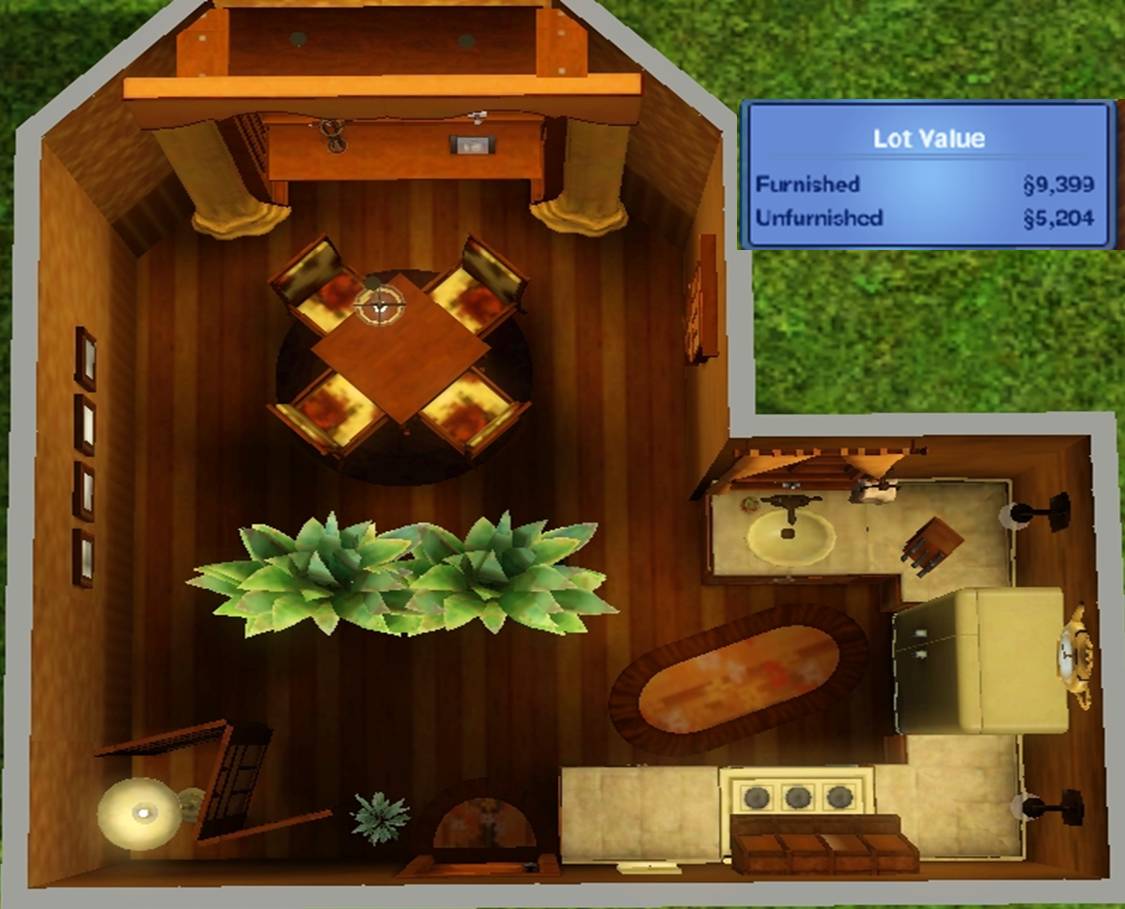
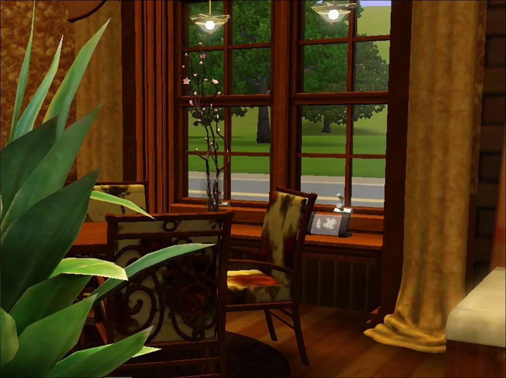
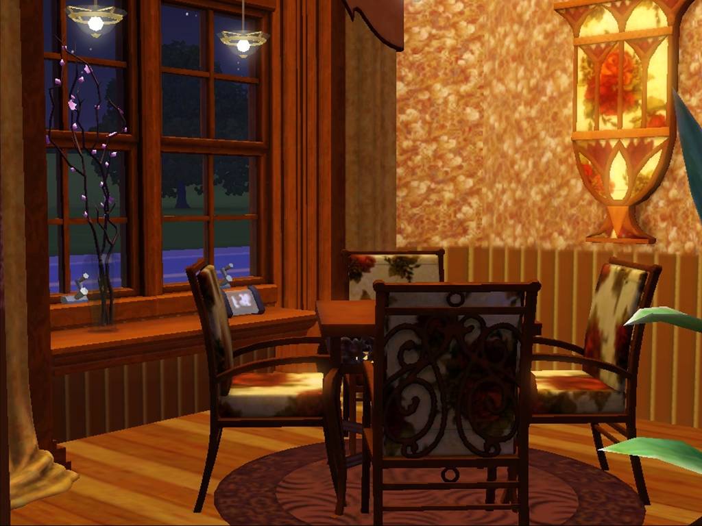
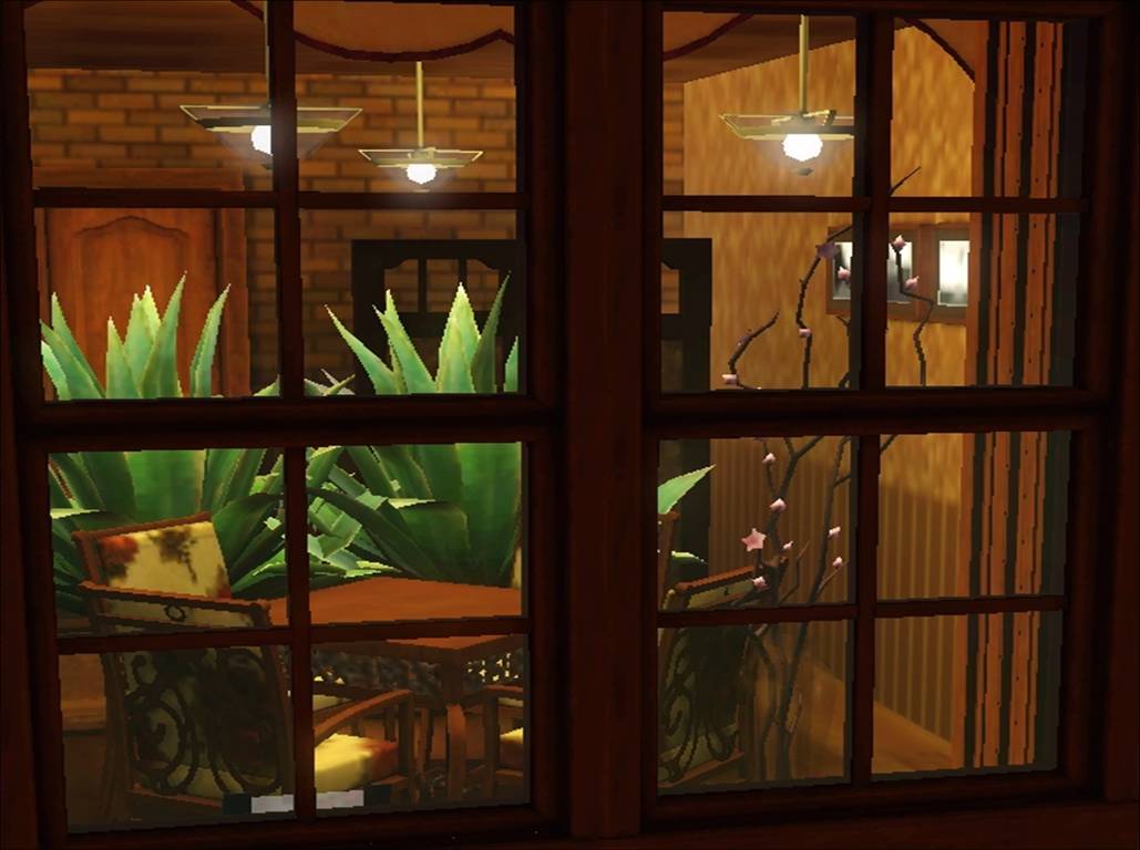
So, here is my Round 2 entry, Dining/Kitchen. I finished it before I read the judges comments, but having lived with it for a few days, I think I will keep it. I did still include one shot from outside the window...but that is because I really like looking in to windows at night as we drive down the road. It makes the house look homey to me. So, without further ado...oh, wait, one more ado...I also kept to the same basic color palate as the living room cause I pictured them as parts of one big house.
#117
26th Oct 2012 at 4:04 AM
26th Oct 2012 at 4:04 AM
Posts: 1,114
Thanks: 255 in 5 Posts
Dal and sharill, I'm adding you both to the chart now. Great looking entries!
leriety, for your overhead points I want this:
NOT this:
leriety, for your overhead points I want this:
http://www.modyourpanties.com/hosting/40909_121025230330Screenshot-192.jpg
NOT this:
http://www.modyourpanties.com/hosting/40910_121025230415Screenshot-193.jpg
Lab Assistant
#118
26th Oct 2012 at 9:36 AM
26th Oct 2012 at 9:36 AM
Posts: 169
Oh ok, I just don't undestand why no one told me before. Seeing the other entries I thought we just needed a picture with the value...
But then why was my entry accepted, isn't the overhead picture part of the main rules?
But then why was my entry accepted, isn't the overhead picture part of the main rules?
#119
26th Oct 2012 at 3:42 PM
26th Oct 2012 at 3:42 PM
Posts: 441
Thanks: 755 in 9 Posts
Quote:
| The overhead picture is a little too dark and too small, making it hard to see the details. |
Sorry about that. ^^; I don't know why it looks like that, maybe it has something to do with the prt sc button, I used it instead of "C" in game. I'll go try to find it a fix for it.
I totally see what you mean about the sofa now.. <w<
Well anyways, thanks for your time. o:
#120
26th Oct 2012 at 3:47 PM
26th Oct 2012 at 3:47 PM
Here goes for my round two entry! I think I may have overdone the green just a tad but, by jove, I'm sticking with it now.
Budget and overhead. I cut it rather close this time.

View from the door.

View from the dining table.

View from the corner.

View of the kitchen section.

Budget and overhead. I cut it rather close this time.
View from the door.
View from the dining table.
View from the corner.
View of the kitchen section.
#121
26th Oct 2012 at 5:21 PM
26th Oct 2012 at 5:21 PM
Posts: 1,114
Thanks: 255 in 5 Posts
Menaceman44: Great kitchen! Adding your round 2 entry to the chart now.
leriety, I accepted your entry because I missed the fact that you were missing the overhead photo the first time I looked over your entry. But when I did notice we were already filling up fast and I thought it would be fairer to you to dock you points that to kick you and risk the contest filling up while you took another photo.
leriety, I accepted your entry because I missed the fact that you were missing the overhead photo the first time I looked over your entry. But when I did notice we were already filling up fast and I thought it would be fairer to you to dock you points that to kick you and risk the contest filling up while you took another photo.
#122
26th Oct 2012 at 7:34 PM
26th Oct 2012 at 7:34 PM
Posts: 47
Thanks: 1 in 1 Posts
Two questions:
Are we allowed to use the OMSP Resizer?
Can we use the modular seating to go around a dining table? The reason why I ask is because I'm pretty sure they are functional with a coffee table or no table, but when you put it with a dining table they are unable to eat at it. They can however sit at them.
"Stand up for what you believe, Even if it means standing alone."
Formerly Toddler430
#123
26th Oct 2012 at 7:39 PM
26th Oct 2012 at 7:39 PM
Posts: 1,114
Thanks: 255 in 5 Posts
Yes you can use the OMSP resizer. Could you link to it here for everyone else? I tried to find it to link to it but MS3B was being slow and I couldn't find it in my internet history.
I really like the idea of using modular seating, but one of the room requirements is for the room to be playable so not being able to use the dining room table would break that rule. Sorry, but thank you for asking.
I really like the idea of using modular seating, but one of the room requirements is for the room to be playable so not being able to use the dining room table would break that rule. Sorry, but thank you for asking.
#124
26th Oct 2012 at 7:44 PM
26th Oct 2012 at 7:44 PM
Some modular seating can be used with dining tables, especially the ones that came with LN.
"Holy Shift! Check out the asymptotes on that mother function!"
"Holy Shift! Check out the asymptotes on that mother function!"
#125
26th Oct 2012 at 7:49 PM
26th Oct 2012 at 7:49 PM
Posts: 47
Thanks: 1 in 1 Posts
Quote: Originally posted by daluved1
| Some modular seating can be used with dining tables, especially the ones that came with LN. |
So both the ones from LN work?
OMSP Resizer You Must have the OMSP installed for this to work, otherwise your game will crash on start up. Please read the mod description for more info.
Edit: Are the Invisible lights from BuyDebug allowed?
"Stand up for what you believe, Even if it means standing alone."
Formerly Toddler430
Who Posted
|
|