#1

2nd Jan 2008 at 7:09 PM
Last edited by HystericalParoxysm : 4th Jan 2011 at
9:02 PM.
 Tiptorial: Making Black and White Clothing (The Right Way!)
 What this tiptorial is for:
Most beginning creators make some pretty common mistakes in creating black or white clothing - not only do they do a solid bucket fill, but they choose pure black or pure white.
This tiptorial (yes, tiptorial, isn't that a cute word?) is designed to show you why it's bad to do it that way and, more importantly, show you the right settings and the right way to do it instead.
Why actual black and actual white are bad:
Here's a quick little demonstration that will hopefully be illustrative of the difference between the right way and the wrong way:
In-game, the pure black (RGB 0.0.0) bucket fill applied to the "wrong way" version reflects no light whatsoever, and actually looks a bit like a "hole" in the picture. You get none of the in-game shading and highlighting from lighting on the mesh whatsoever.
The "right way" is a Maxis texture, and is maybe a little bit lighter than I would go for had I made the texture myself, but you can get the idea of what you should be going for - there's no true, pure black used on the texture itself, yet it looks black (or extremely dark grey, which is what most actual black garments are) in-game.
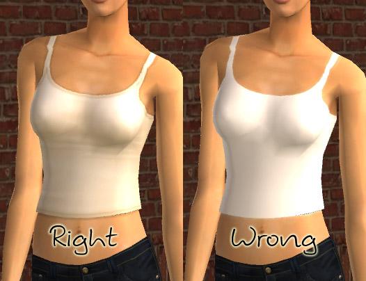
On the "wrong way" version here, which is a pure white (RGB 255.255.255) bucket fill, it doesn't look quite so bad as the pure black did above, as you get a little bit of the game's lighting applied to it, but it's quite blinding, especially in bright light.
Again, I used Maxis textures for my "right way" one, so it's a little bit cream, with a yellow tinge to it (which you don't have to do to make something look white), but again, it gives you an idea of what you should be going for - there's no pure white anywhere here, but a range of light shades.
Suggested Settings:
If you're making a
black garment:
Your base colour should be something like RGB
50.50.50 (dark grey)
Your highlight colour should be something like RGB
90.90.90 (lighter grey, but still not white).
Your shadow colour should be something like RGB
30.30.30 (very dark grey, but still not black).
If you're making a
white garment:
Your base colour should be something like RGB
200.200.200 (light grey)
Your highlight colour should be something like RGB
235.235.235 (lighter grey, but still not white)
Your shadow colour should be something like RGB
160.160.160 (darker grey, but still not black).
How to Add Highlights and Shadows:
Faylen has a great tutorial that shows the basic techniques for adding highlights and shadows to a garment using blurred lines:
How to Add Shadows and Highlights
It's a good basic technique, though personally, for that, I use a fuzzy brush and just paint lines over the texture in black and white myself (rather than using the line tool).
You can make the brush bigger or smaller for bigger highlights/shadows, or smaller ones (in the tutorial she pretty much uses all the same thickness of line to do it - I prefer varying it some). You can trace over an existing outfit like shown there, or just start adding blobs of light and dark where you think they should go (highlights belong on breasts, bellies, and butts, shadows belong on inner thighs, underarms, etc.) and see how it goes.
You can also do something other than just lines too - adding shapes of highlight and shadow in areas that would tend to have a round or oval highlight (like the back of a pair of jeans, or a kneecap) and then blurring those the same way.
I also tend to prefer to use -just- black and white, and doing them on separate layers (I have my white highlight layer, and my black shadow layer) so that I can change the layer blend type and the layer opacity separately. I find grey tends to wash out the texture a little bit, reducing the saturation and detail, so using just black and white for highlighting and shadowing works a little better. Of course, this seems to contradict what you just learned above, but once you blur things and adjust the layer opacity or blend type, it won't be pure black or white anymore.
You can change the white highlight layer to Lighten or Screen to overlay the texture properly... and the black shadow layer to Multiply to overlay it properly too... Then you don't lose detail on whatever texture you're using, but you still get nice shadows and highlights.
 Sign in to Mod The Sims
 What this tiptorial is for:
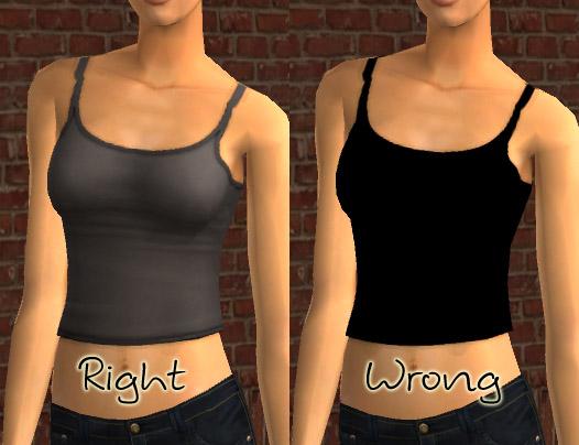
 Thanks so much for the tips!
